Student Beans
The challenge for the Student Beans brand refresh was to create a visual identity that resonates deeply with the contemporary student audience. We needed to:
- Modernize the Brand: Incorporate contemporary design elements that appeal to the current generation of students, ensuring the brand feels relevant and engaging.
- Enhance Visual Appeal: Develop a vibrant and exciting color palette that captures the energy and creativity of student life while distinguishing Student Beans from competitors.
- Capture Attention: Use typography that demands attention in a friendly, non-confrontational manner, making our messaging clear and impactful.
- Reflect Youthfulness: Create an overall look and feel that embodies fun, excitement, and youthfulness, making students feel connected and understood.
- Ensure Cohesiveness: Design elements needed to be cohesive across all platforms, from digital to print, maintaining a consistent and recognizable brand identity.
Addressing these challenges required a thoughtful and strategic approach to creative direction, aiming to elevate the Student Beans brand to new heights of engagement and relevance.
4D Characters
Enhanced Engagement: The use of 4D characters adds depth and personality to our marketing materials. Their lifelike, animated qualities make our content more interactive and appealing, driving higher engagement and connection with students.
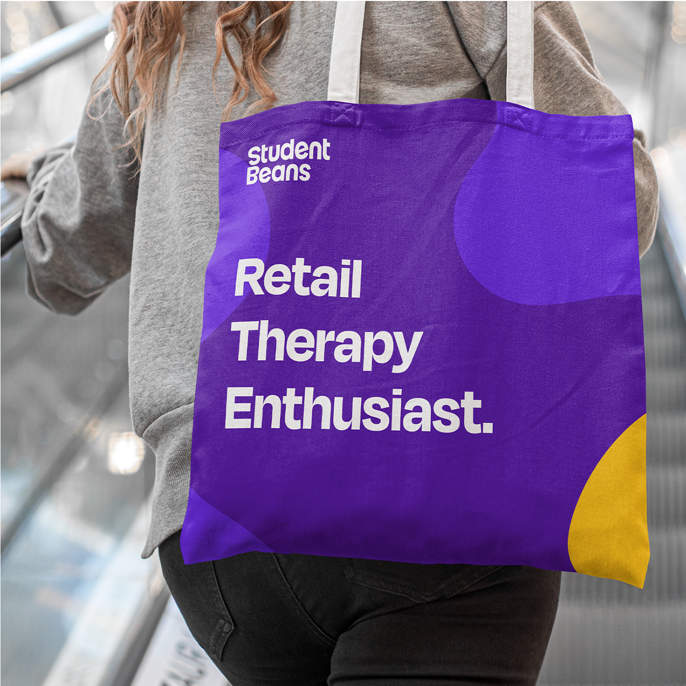
Color Palette
Vibrant and Youthful: The new color palette of purple and mustard yellow is chosen for its vibrant and exciting qualities. Purple conveys creativity and sophistication, while mustard yellow adds a burst of energy and positivity. Together, these colors create a youthful and lively atmosphere that is visually stimulating and appealing to our target demographic.
Excitement and Energy: These bold colors are designed to evoke excitement and enthusiasm, aligning with the dynamic lifestyle of students. They help differentiate Student Beans from competitors, making our brand instantly recognizable and memorable.
Typography
Attention-Grabbing Display Font: The new display font demands attention in a non-confrontational way. It is bold yet friendly, ensuring that our messaging stands out without being overwhelming. This balance helps maintain clarity and readability while emphasising key information and calls to action.
Overall Look and Feel
Fun and Excitement: The primary look and feel of the refreshed Student Beans brand is centered around fun and excitement. Every design element, from the 4D characters to the vibrant colors and bold typography, works together to create an atmosphere of joy and energy. This reflects the spirited and adventurous nature of student life.
Youthfulness: Our refreshed visual identity captures the essence of youthfulness. It speaks directly to the interests and aspirations of students, making them feel understood and connected to the Student Beans community.
Gallery